

One of the easiest ways to make your family photography in Minneapolis look polished and cohesive is by choosing a well-coordinated color palette. Whether your family is laid-back, dressy, or somewhere in between, your clothing choices play a big role in how your photos feel—and how timeless they look hanging on your walls for years to come.
Here are three of my favorite color palettes that work beautifully for indoor studio sessions, plus some style tips to help you feel confident and camera-ready.
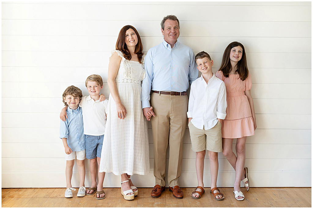
Family Photography Wardrobe Palette Highlight: Sky
Fresh, Neutral & Classic
A soft, breezy combination of blues, whites, greys, and beige, the Sky palette is a go-to for a reason. It feels clean, calming, and easy to coordinate—and it flatters every skin tone.
Why it works:
These tones bounce natural light beautifully and bring a light, airy feeling to your portraits. They’re especially lovely in my North Loop studio, where soft backgrounds and neutral décor make the colors pop without being overpowering.
Best for: Spring and summer sessions, minimalist homes, and families who prefer a casual but pulled-together look.
Style tip: Add texture with denim, chambray, or a knit sweater. Bare feet or neutral-toned shoes keep the look soft and cohesive.
Family Photography Wardrobe Palette Highlight: Neutral
Earthy, Warm & Timeless
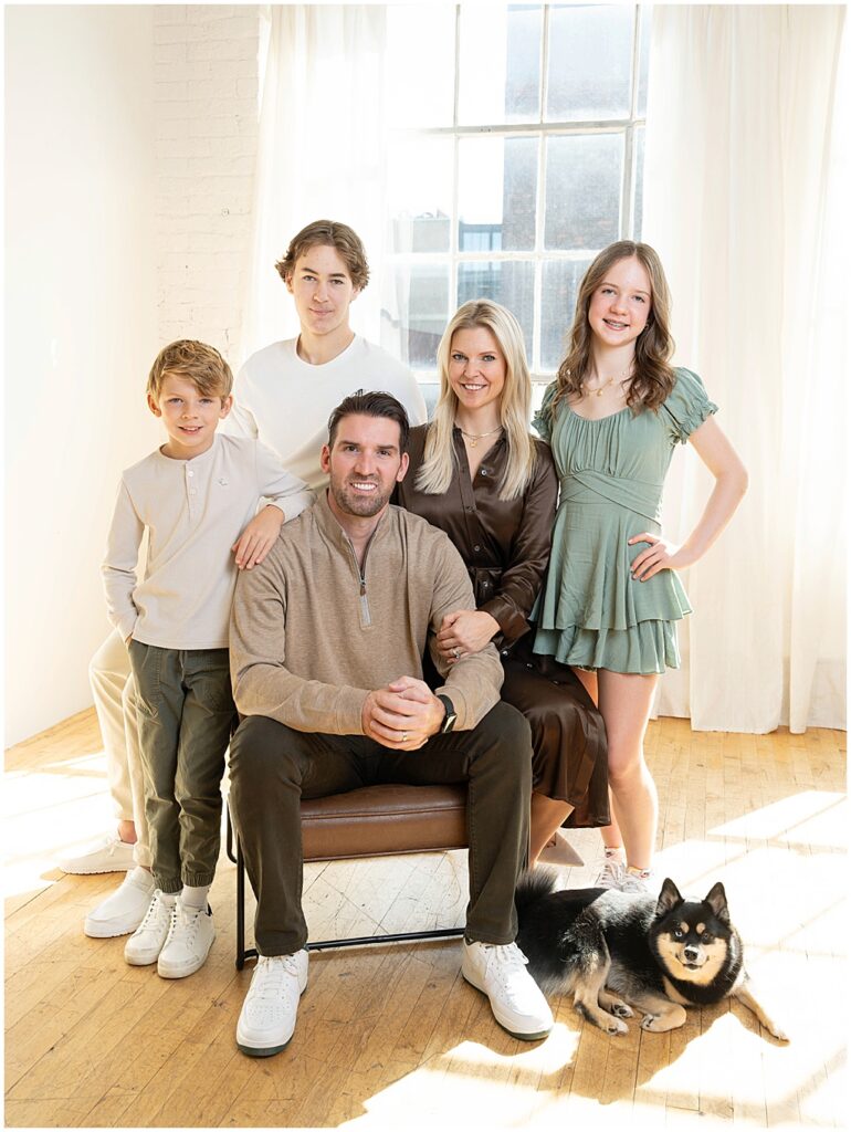
Earth tones like browns, olive greens, soft whites, and greys come together in the Neutral palette, offering a grounded, timeless feel to your portraits.
Why it works in studio:
These tones feel cozy, natural, and effortlessly elegant. They add depth without distraction and photograph beautifully in studio lighting.
Best for: Fall and winter sessions, cozy family portraits, or homes with wood, leather, or earth-toned décor.
Why it works:
These tones feel cozy, natural, and effortlessly elegant. They add depth without distraction and photograph beautifully in studio lighting.
Best for: Fall and winter sessions, cozy family portraits, or homes with wood, leather, or earth-toned décor.
Style tip: Bring in interest with layers—think a chunky knit cardigan, a textured scarf, or a hint of pattern in one person’s outfit.
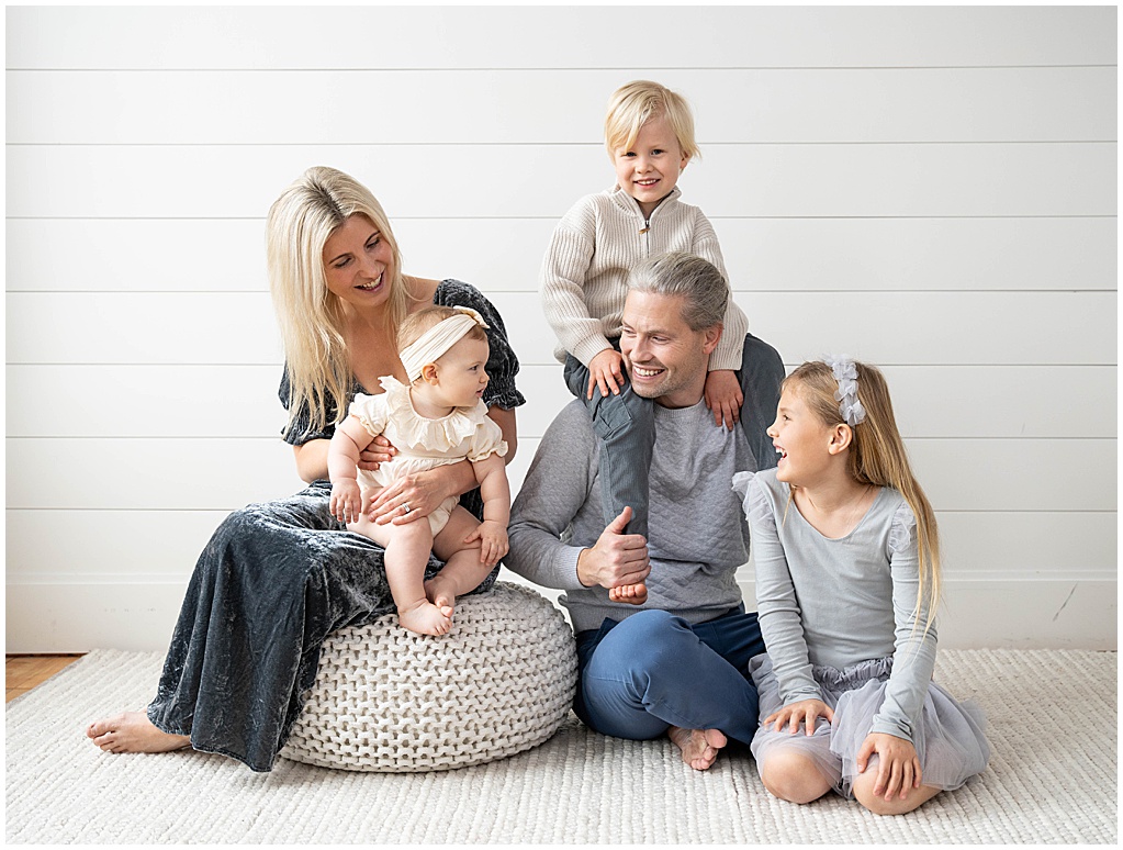
Family Photography Wardrobe Palette Highlight: Pastel
Soft, Airy & Light-Filled
Why it works:
Pastels reflect light beautifully and add a sense of calm and openness to your images. In a studio setting, these tones keep the focus on your family’s connection while adding a clean, refined aesthetic.
If you’re drawn to a gentle, dreamy look, a pastel color palette is the perfect choice. Think blush pinks, soft blues, mint greens, lavenders, creams, and pale greys—colors that whisper rather than shout.
Best for: Spring and summer family sessions, maternity photography, or milestone portraits where you want a light, fresh vibe.
Style tip: Keep the look cohesive by mixing solid colors with soft textures—like linen, lace, or lightweight knits. Avoid bold patterns so the softness of the palette can really shine.
How to Choose the Right Palette for Your Family Photos in Minneapolis, Edina, Wayzata and beyond
Every studio family session at Meghan Doll Photography includes personalized styling support. Whether you’re drawn to Sky, Neutral, or Pastels—or want help building your own palette—I’ll guide you through wardrobe selection to make sure you look great, feel confident, and love your images for years to come.
Not sure which direction to go? Ask yourself these quick questions:
- What’s your family’s style? Casual? Polished? Playful? Choose colors that reflect your vibe.
- Where will the photos live? Think about the tones in the room where you’ll hang your prints and try to coordinate with that space.
- What season is it? While studio photos aren’t weather-dependent, the seasonal vibe can still influence your choices—light and airy in spring, rich and layered in fall.
Planning outfits for your family photo session doesn’t have to be stressful. In this guide, Minneapolis family photographer Meghan Doll shares her favorite studio-friendly color palettes—including pastels, earth tones, and classic blue tones—and offers expert tips on how to coordinate your family’s wardrobe for timeless, light-filled portraits you’ll love for years to come.
To book your session or schedule a quick Consultation, feel free to reach out! Let’s create portraits that feel as good as they look.